Sunday, 15 January 2017

Directions Unit: Chosen Director / Scene Selection

STANLEY KUBRICK
(1928 - 1999)

Kubrick was born in 1928 and raised in the Bronx, New York City, before moving to England, Hertfordshire in 1961. Working as a photographer in the 1940s, he soon began making short films by the early 1950s. His early major film works were collaborations with filmmakers such as Kirk Douglas (Spartacus / Paths of Glory) and Peter Sellers (Lolita / Dr. Strangelove).

Quickly becoming a well-known name for his meticulous attention to detail and perfectionist techniques, Kubrick’s cinematography broke new ground using scientific realism and innovative special effects in 2001: A Space Odyssey. From this point, Kubrick was in exceptionally high demand, directing some of films such as Barry Lyndon, A Clockwork Orange (1971) and The Shinning (1980). His final film, Eyes Wide Shut, was completed in 1999 – shortly before his death.

DIRECTING STYLE
Stanley Kubrick is someone who has proved pivotal in my own journey to filmmaking, as I remember growing up watching films such as Spartacus (1960) and 2001: A Space Odyssey (1968). Though not understanding the significance of what I was watching, I always admired the visual spectacle and attention to detail always placed at the forefront of Kubrick’s work.

A  visual spectacle - Spartacus (1960)
Cinematography from
2001: A Space Odyssey (1968)
As part of this visual impact, one of the hallmarks of Stanley Kubrick’s films are his protracted, uncompromisingly slow scenes. For example:

2001: A Space Odyssey

No montage here, no time-compressing cutting techniques: instead, Kubrick shows us Bowman disconnecting the computer one module at a time, with absolutely no shortcuts.

To accompany these long scenes, every one of Kubrick’s films has at least one long, uncut tracking shot, usually with the camera “pulling” the character. As seen in:


The Shining
Very long Steadicam shots of Danny riding his tricycle along the corridors in the hotel 
(“pushing”)

A Clockwork Orange
The record shop scene, in which the camera pulls Alex as he walks around the shop (this is also a fine example of the use of extreme wide-angle lenses)

Kubrick was one of the first directors of his time to make a very bold use of extreme wide-angle lenses, as well as extreme camera angles:

The Shining


2001: A Space Odyssey


SCENE SELECTION
I have chosen to adapt a selection of scenes from A Clockwork Orange (1971) – one of Kubrick’s better known (and controversial) works.


To begin my piece I have chosen this scene, perfectly demonstrating both the tone of the film itself. The power of music within the film is also very prominent here, and I hope that within my own directing style I will be able to play on this.


To transition between the 2 scenes, I would like to shortly focus on the setting of the Korova Milk Bar - creating an ellipsis between the bloody violence of the first scene and the clinical setting of the second.


(1:14) I also want to look at this scene of Alex with his psychiatrist, as I feel like I can possibly direct the action in a more engaging way than a simple shot-reverse-shot. The scene is also significant as the audience gets a small insight into Alex's brain and the impact of this on his actions - bringing my short narrative to a close.

Wednesday, 7 December 2016

Contextual Studies: Critical Review

UTOPIA (2013-14)
Critical Review

UTOPIA, created by Dennis Kelly is a British thriller, first aired on Channel 4 in 2013. The story follows a small group of people who find themselves in possession of the manuscript sequel of a graphic novel called The Utopia Experiment - rumoured to have predicted the worst disasters of the last century.
Examples of cinematography from the series
One of the initial aspects of the series that stood out to me its cinematography. The colour palette used is extremely saturated, replicating a bold aesthetic used by the graphic novel the series is based on. In order to achieve this, director Marc Munden referred to the Technicoulor of 1950’s Hollywood, explaining; "We chose certain colours like yellow and turquoise and painted them into the shots afterwards. The skies that we shot weren't always blue, they were mostly grey British skies. The same goes for making grass greener, eyes brighter, or turning a blue van yellow." (Wired, 2014) This is an interesting stylistic decision for the series, as the narrative’s themes of the series itself are extremely dark, with the protagonists combatting hyper-violence, sterilisation and mass murder. However, “UTOPIA” discusses ideas of creating a new Utopian society, and the individuals within The Network’s dedication to this moral ideology. Perhaps this links to the idea of modernism, and the rejection of traditional convention to create the “new” - using expressionism to conceive a bright future. Therefore, this dedication to a unique colour palette not only reflects the series’ central theme, but also suggests a reinvention of society by going against traditional convention in Western media (in this case, colour in Television).
Similarly to the cinematography, UTOPIA’s sound design is also very unique. Its non-diegetic soundtrack combines sounds from the show (for example sound effects such as breathing, or lines of dialogue) with exotic instruments and dissonant tones to create the perfect atmosphere of unease and dislocation:

Rob Smedley describes the soundtrack itself as “resulting in an experience that’s unique to TV composition, like a gallery of modern art it bypasses your logic centres and goes straight for a gut reaction.” (Cultbox, 2013) Despite using extracts from the series itself, the music rejects all conventional musical structures such as key or time signatures, creating a lucid, dream-like feel - distorting what the audience conceives to be real within the series. When accompanying a scene, therefore, the soundtrack creates a sense of surrealism, creating a juxtaposition between the real (visual) and the distorted (aural) - again adhering to the narrative itself, which focuses around a vision of the future coming into reality.
In conclusion, UTOPIA (2013-14) is a Series unique from many airing currently, setting itself aside from others of its genre as it utilises the basic elements of narrative depiction through moving image (i.e. camera, sound, mise-en-scene and editing) to create its own unique aesthetic style; and comment on modern society as it stands today, focusing on current themes and applying a sense of realism to the story – forcing an audience to engage and wonder about their own future.

Word Count: 500
Bibliography:

Thursday, 1 December 2016

Story-Telling Unit: Critical Evaluation

CRITICAL EVALUATION
(Thursday 1st December)

"A film is - or should be - more like music than like fiction. It should be a progression of moods and feelings. The theme, what's behind the emotion, the meaning, all that comes later."
Stanley Kubrick

Looking back over what I have achieved in the past few months, I realise that I am proud of my final product. I look at my initial idea, and how that evolved and developed over time; and despite the work being quite a step-up from what I did last year, I have managed challenges well. For example, my problems with actors and locations were eventually rectified, and despite filming several weeks after schedule, everything has been completed. My final location worked out very well, and despite not getting all of the coverage I might have needed on, I coped without in post-production.

Similarly in my script, I have now adapted my story and characters profusely from my original idea, and I have come up with too many different ideas to count, but with the assistance from my script tutorials I have a final, completed narrative that I am satisfied with. I have learnt plenty about the art of screenwriting and scripts themselves, but I also hope to learn more through future units, as it is this aspect of my work that I have enjoyed the most.


Having said all of this, there are several things I would have, in hindsight, done differently. 

Before even filming began, I would’ve like to have been more organised / managed my time better especially with regard to locations, so I wouldn’t have had to mess about and get permission for one not ideally suited to my film – only to push back my shooting for another week. Even when I found a more ideal location, I will in the future remember to check the weather before any shooting happens. 

Furthermore, if filming at night, or in a dark place, I would have liked to use sufficient lighting. Although this issue can potentially be amended in post-production, extra lighting would assist the process. Or alternatively, film in the day and darken the footage in post-production. This was a pretty big issue in my film, as it meant that certain important plot details could have potentially been obscured to the audience.

As well as this, I would’ve liked to have been more prepared on shoot with regards to shot-lists / storyboards. I did have my storyboard on set, and I followed it very closely, but I think in hindsight I would have had a shot-list as well – to ensure I had plenty of coverage and didn’t miss anything out. I’m pretty happy with all of my shots individually, though I would maybe think about smoothing out my opening shot – as even using warp stabiliser there is still a bit of shake in the footage.

Regarding my script, I would now have worked harder on it, completing more drafts and asking for more feedback. I am satisfied with my final piece and how much it has evolved, but I would’ve potentially liked to develop it more, for example, looking more into dialogue and giving it more of a dark-humoured twist.

To conclude, I am very happy with the way my final film and script have turned out, I just hope to be more prepared in my future projects in order to reach the highest possible standard.

Wednesday, 30 November 2016

Story-Telling Unit: Script Final Draft

SCRIPT FINAL DRAFT
(Wednesday 30th November)

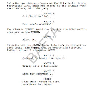
Dialect in Attack the Block (2011)
For the final draft of my script, I have had to massively cut down my words, resulting in losing 2 pages off my total. I also had to lose quite a lot of dialogue to make room for my new ending and an added scene, but this wasn’t too difficult, because when it came down it I could easily see that with my new storyline a lot of old dialogue was no longer necessary.

I have also included a small new scene with an innocent bystander, explaining the unexpected arrival of the police and paramedics to the scene. Also, I have worked on formatting my capitalising important of impactful words in my directions.

Finally, I did some research into accent and dialogue in screenplays, including the final script for Attack the Block (2011). Although this dialect is very different from the one I have tried to portray for Adam, this still helped me examine how they are written for film and TV, assisting me with my work.

Story-Telling Unit: Final Cut


FINAL CUT
Wednesday 30th November


My final cut of A Dead End, for the project of The Meeting is finally complete.
From the Second cut, I have added the finishing touches of titles and credits, as well as completing my colour correction and including more sound effects - such as the phone dialing tones, second brick hit and final police sirens.

Narrative-wise, after talking to Mike he suggested that I should really have more of a focus on the body from the beginning. Therefore I have included some more shots of the dead man, such as the close-up seen at the beginning to really resonate with the audience the dark and serious nature of my story. 

Concerning the dialogue scenes between Adam and Eve, I have also sped up the pace of editing slightly, using tools such as the ripple edit, rollover and slip and slide tools to layer audio and visual - creating a much more natural, free-flowing effect. 


My Final Edit Track


Audio issues also had to be solved, as some of my dialogue / sfx were too quiet in comparison to the rest of the scene. This was done through Adobe Audition software, allowing these issues to be solved fairly swiftly and easily.


Tuesday, 29 November 2016

Story-Telling Unit: Second Cut

SECOND CUT
(Tuesday 29th November)

After completing my first cut, I finally had a chance to film on Wednesday 8th – managing to combine the two shoots to finish my narrative. I have also had the opportunity for Mike Rymer to look at my work, giving me more ways to improve.

Logo improvement
Firstly, I have made a minor change in typography to my logo, changing it to Bebas to look more professional / match the font of my logo.

To add realism to my film, I have included the sound effect of the brick hitting Adam’s head, as well as an atmospheric track of city sounds underneath the whole thing, setting the scene - which I could not get from the mono-directional Rode mic used for dialogue. I have also purposefully left a silence on my long opening shot for cinematic effect, choosing not to include my music.

I have also had to change some of my original dialogue and narrative structure to my opening two minutes. Due to coverage issues, I did not get the shots I needed on location to make my story clear. Like Mike suggested, I could have gone back on location with my actors and shot some pick-ups, but this is inconvenient for both me and my actors/crew. Therefore, I have gone slightly astray from my script, cutting out some dialogue and actions to make the story make sense, and cut down the length of the film.

Finally, I have worked on colour correction, as part of my feedback was due to a lack of light people were losing my story – missing important details such as Adam in the foreground:

Before colour correction
After colour correction - only a slight difference to make it
unnoticeable, but very effective
Or a close-up of his hands bound: 

Before
After - now the audience will be able to see clearly
what is in the frame
This had definitely improved my film, making my narrative clearer. 

Contextual Research - Inside No.9

Inside No.9
Contextual Research - TV Drama


Inside No.9 is a British dark comedy-drama, written and directed by Steve Pemberton and Recce Shearsmith. The show follows a procedural format, each episode linked by only one thing - the main location being a No.9 (i.e a No.9 house, or room). The episodes stretch across genres, but retain a similar style of dark humour, usually with a significant twist at the end of the story. Each individual episode is a brilliant story on its own, combining a blend of comedy with deep, dark horror to create an individual style of writing. In order to contextualise the series, I will be looking at 2 episodes in particular, Sardines and A Quiet Night In.

Sardines
Sardines, taking its names after the game, takes place in an extremely enclosed space. This is perhaps challenging in terms of writing, as hardly any action takes place - leaving the whole story to completely rely on its characters and the interactions between them. 


Sardines' twist ending

The story is also effective as we are introduced to characters one by one, gradually becoming more and more crowded within the small cupboard; and accelerating the narrative's pace. As the increased number of characters begin to clash, they are distracted from more important events - not noticing that one of the missing members of their part is not who they though he was. This therefore acts as a crescendo to a dramatic twist ending.

One of the things I admire in Shearsmith and Pemberton's work (especially in this series) is the ability to create such in depth characters and relationships between them that the audience is gripped to a story with minimal action. Gripped so much in fact, that the final scene has a very powerful shock factor - after watching it myself, I was pretty taken aback.


Character work within my own script


Within my own work, my story is somewhat similar as it focuses on the themes of death and entrapment, with little action and more of an emphasis on conflict between characters. I have looked at this series pretty closely for character work in general, as it harbours such a wide range and variety of personalities from different backgrounds, periods and situations. I aimed to make the characters in my script, Adam and Eve, seem somewhat realistic in an improbable scenario.


A Quiet Night In

In contrast to Sardines, A Quiet Night In is essentially completely silent (apart from a few small lines of dialogue), and therefore relies quite heavily on action and screen directions. For example:


However, this lack of dialogue actually proves to be extremely effective in practice, as the camera is used as an effective tool to assist the action in telling the story:

Constant cutaways to facial expression - before the audience even knows
Eddie is allergic, the audience knows something is wrong.
Low angle of large dog - emphasises its size and significance as a threat to the robbery.
The written script for the dog scene

The importance of camera is vital in any story, but in this episode it works particularly well as from the beginning the audience automatically roots for the burglars not to get caught - constantly suspending them. The fact that there is no verbal explanation to what is happening forces the audience to glue themselves to their screens, making for attentive watching.

In the format of screenwriting, the stage directions may be extensive, but the wording is straightforward and minimal. This adheres to advice given in my tutorials with both Steve and Simon, who when reading through my script both told me to cut down my wording, focusing on:
  1. Only writing about what can be seen in the frame (i.e. no "assumes" / what the character is thinking)
  2. No waffley words, keep it straightforward
This advice has therefore helped me in my final script edit, helping me to both simplify my directions and make space for more progressive content such as character development through dialogue.

Final Thoughts
When deciding what episodes in particular to look at as part of contextualising this series, I chose these two episodes, Sardines and A Quiet Night In in particular as they are both polar opposites of one another. Sardines contains multiple characters in a small space, relying on character and dialogue to progress its story. A Quiet Night In, on the other hand, has a minimal cast in a big house, with minimal dialogue - relying on physical action to progress its narrative. By choosing these, I could not only look at different aspects of film-making, but also look at camera and dialogue / character individually. Furthermore, I feel these 2 episodes properly represent the series as a whole - depicting its trademark dark comedic aspect, unique format and enriched character work.